Purpose
The purpose of this report is to display attendance and absence metrics for employees as dashboards in the Integrated HR-Payroll System.
Report Description
This dashboard displays attendance and absence metrics for employees.
Report Location
PT: Quota Payouts
Report Uses
- This dashboard combines many elements from the current Time reports into easy-to-read graphs and charts.
- Overview tab displays attendance/absence hours, absence rate and attendance/absence percentage for the prior 12 months. Also provided is the Absence vs Planned hours for the current three-month period.
- Payout tab provides hours compensated and estimated cost from IT416 by month.
- Comp Time tab displays the remaining hours of all types of comp and the estimated cost and number of hours expiring each month from the remaining balances of IT9901.
- Liability tab is a combination of the leave hours taken and estimated cost for the month from Time eval. The Liability Leave Expiration by Month tile provides the number of hours of Adverse Weather and CDE Care Leave outstanding and the potential hours to expire by month.
How to Generate This Report
There are no prompts required to generate this dashboard. Click on the report name “B0197: Attendance and Absence” in the PT: Quota Payouts folder, and the report will execute.
The dashboard is generated with data contained in multiple tabs. The initial rendering defaults to showing data specific to the agency OrgUnits for which the user has access.
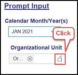
Prompt Input Control
The Prompt Input control has two dimensions which are pre-filled with default values for the initial execution.

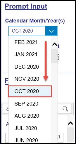
- Calendar Month/Year(s): The default value is set to current month. The value can be changed by using the dropdown arrow.
- Organizational Unit: The default value is the top-level Organizational Unit(s) to which the user has access. The value can be changed by clicking the icon at the end.
Note: Prompt Input values apply to data across all tabs (Overview, Payouts, Comp Time, and Liability tabs) except Analysis Application.
Filter Input Control
The Filter Input control contains many dimensions that can be used to further narrow down the data.
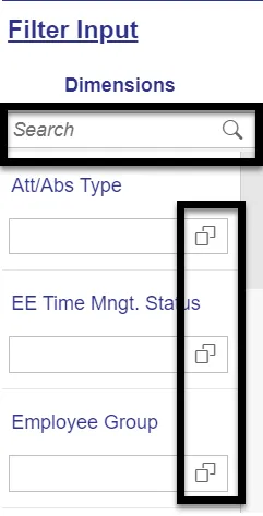
- The Search box allows you to search for specific dimension names.
- Use the icons at the end of each Dimension name to filter for specific values in each Dimension.
- Dimensions Available for Filter Input:
- Att/Abs Type
Note: This dimension filter may work correctly only with chart data relevant to 2001(Absence) and 2002(Attendance) infotypes especially in Overview tab. Using this filter will have a negative or no impact on other tabs. - EE Time Mngt. Status
Note: This dimension filter may work only with chart data relevant to Time Eval related charts. - Employee Group
- Employee Subgroup
- Employment Status
- Personnel Area
- Personnel Subarea
- Time Type Group
Note: This dimension filter may work only with chart data relevant to infotype 2001 and 2002 especially in Overview tab. Using this filter will have a negative or no impact in other tabs.
Note: Filter Input values apply to data across all tabs (Overview, Payouts, Comp Time, Liability) except Analysis Application. Analysis Application Tab functions independently in this dashboard.
- Att/Abs Type
Overview Tab
Below is a sample of the dashboard charts under the Overview tab:
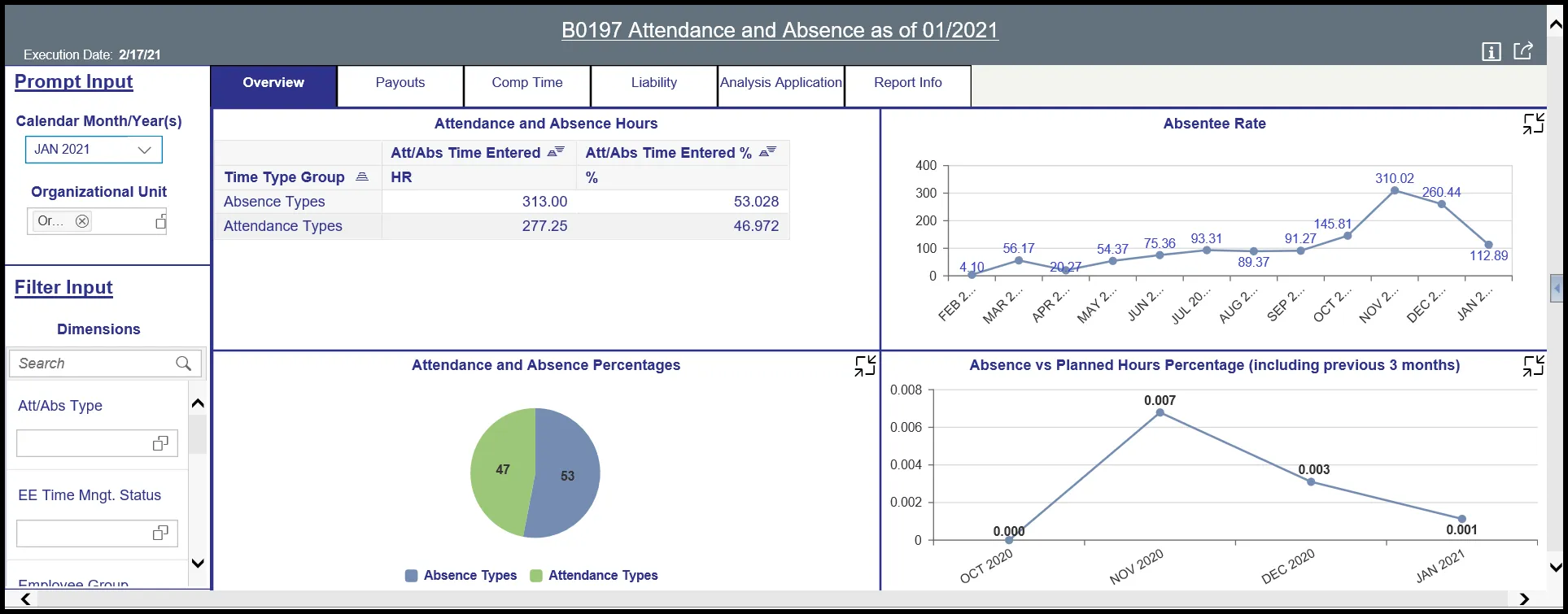
There are four data components displayed in this tab.
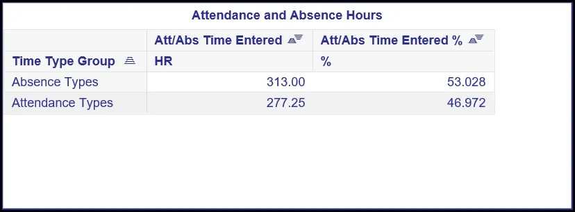
- Spreadsheet component showing Attendance and Absence Hours metrics by Time Type Group.
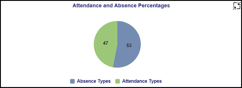
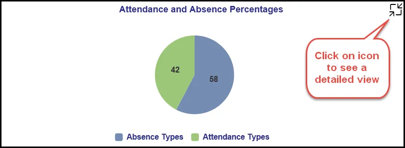
- Pie Chart showing Attendance and Absence ratio in percentages.
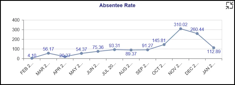
- Line Chart showing Absentee Rate for last 12 months.
- Line Chart showing Absence vs Planned Hours Percentage for the month run plus previous 3 months.
Note: This chart will show only the current month plus the previous 3 months of metrics as the Time Eval data being used in this chart is loaded only for this time-period in the backend BI system. If the Calendar Month/Year prompt is chosen outside this calendar month range, the report will show error indicators in the dashboard. Users can clear these error indicators/messages and proceed.

Many charts contain an icon in the upper right corner to enable expansion of the chart to full-screen view.
Note:
- Detailed view icon on ‘Attendance and Absence Percentages’ chart will show a full screen view of a bar chart showing Attendance and Absence Time Entered percentage and hours by attendance/absence types for the Calendar Month/Year selected.
- Detailed view icon on ‘Absentee Rate’ chart will show a full screen view of a stacked bar chart showing Absenteeism in the last twelve months as of the Calendar Month/Year chosen in Prompt Input.
- To view detailed information for a specific bar or month in this chart:
- Rerun the report for the calendar month/year specific to the bar for which the details sought. (NOTE: Choose desired Calendar Month/Year from Prompt Input dropdown).
- Then Click on the Detailed view icon on at the top right corner of ‘Attendance and Absence Percentages’ chart.
- To view detailed information for a specific bar or month in this chart:
- Detailed view icon on ‘Absence vs Planned Hours Percentage (including previous 3 months)’ chart will show a full screen view of a worksheet detail about ‘Absence vs Expected Hours Ratio’ for the previous 3 months including the calendar month/year selected. This worksheet shows ‘2001 Absence Time Entered HR’ (infotype 2001 hours), Planned Time HR (time eval) and its ratio as ‘Absence vs Expected Hours Percentage’ by calendar month/year.
Payouts Tab
Below is a sample of the dashboard charts under the Payouts tab:
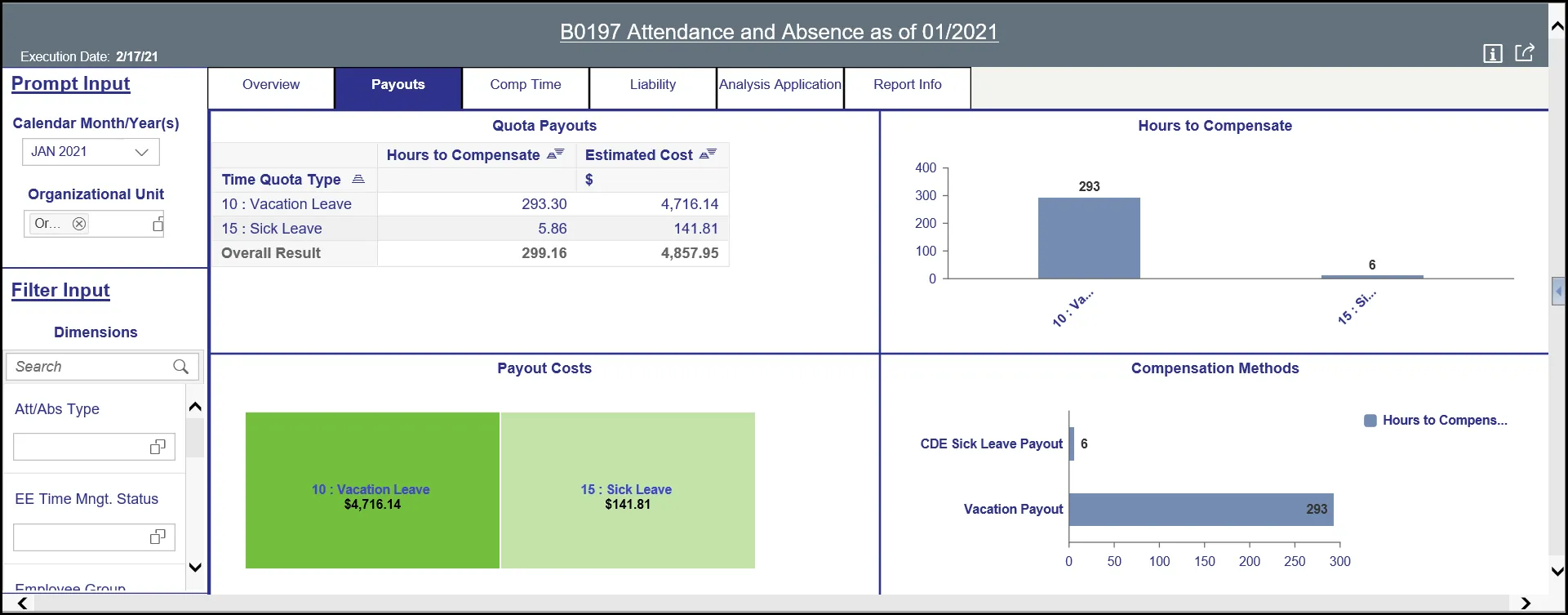
There are four data components displayed in this tab.
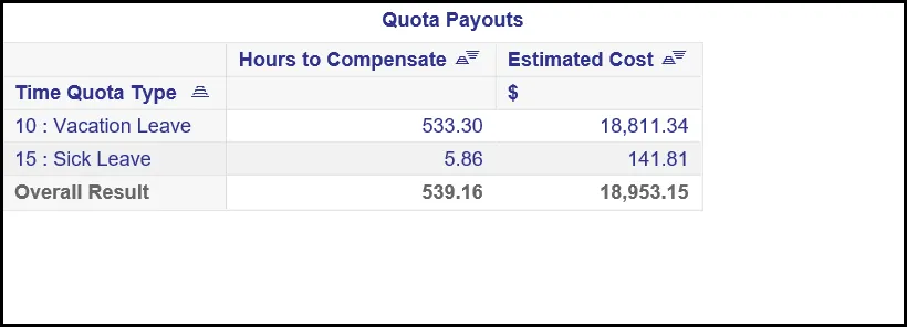
- Spreadsheet component showing Quota Payouts metrics by Time Quota Type.
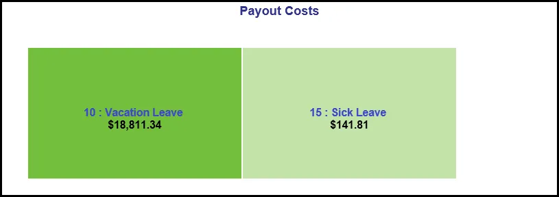
- Heat map Chart showing Payout Costs by Time Quota Type.
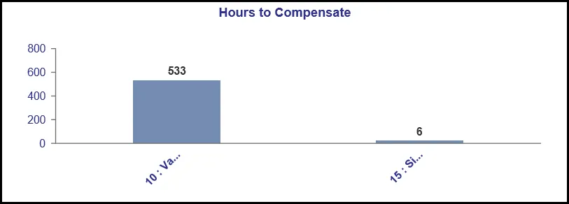
- Column Chart showing Hours to Compensate counts by Time Type Group.
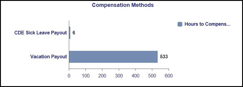
- Horizontal Bar Chart showing Hours to Compensate counts by Compensation Methods.
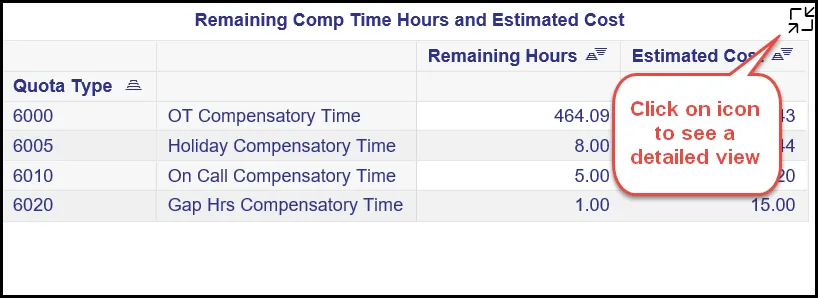
Comp Time Tab
Below is a sample of the dashboard charts under the Comp Time tab.
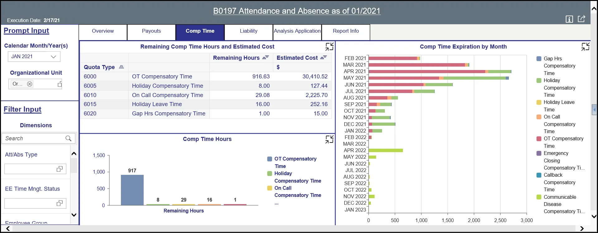
There are three data components displayed in this tab.
- Spreadsheet component showing Remaining Comp Time Hours and Estimated Cost metrics by Quota Type.
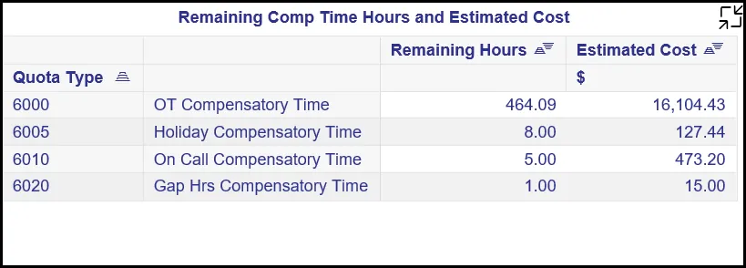
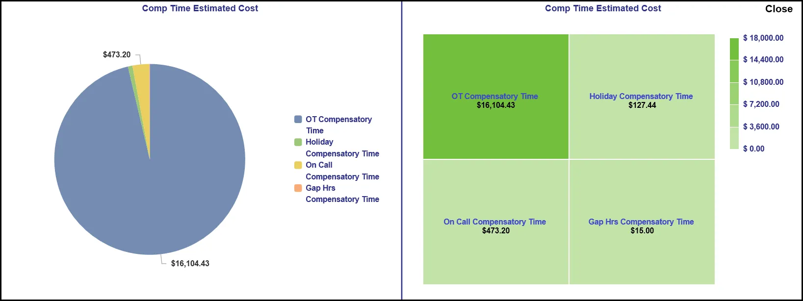
- Column Chart showing Comp Time Hours by Quota Type.
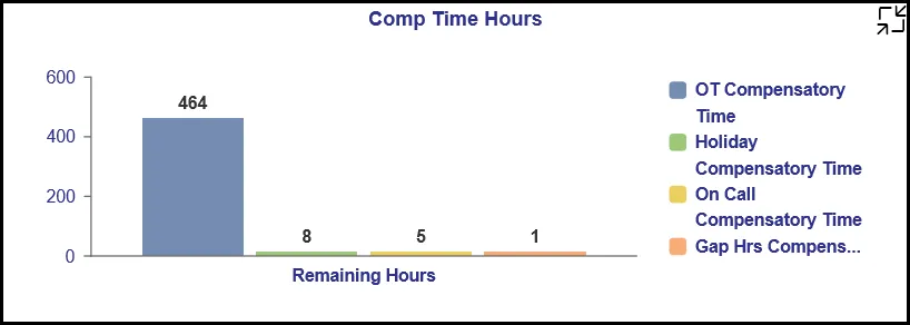
- Stacked Bar Chart showing Comp Time Expiration by Month by Quota Type.
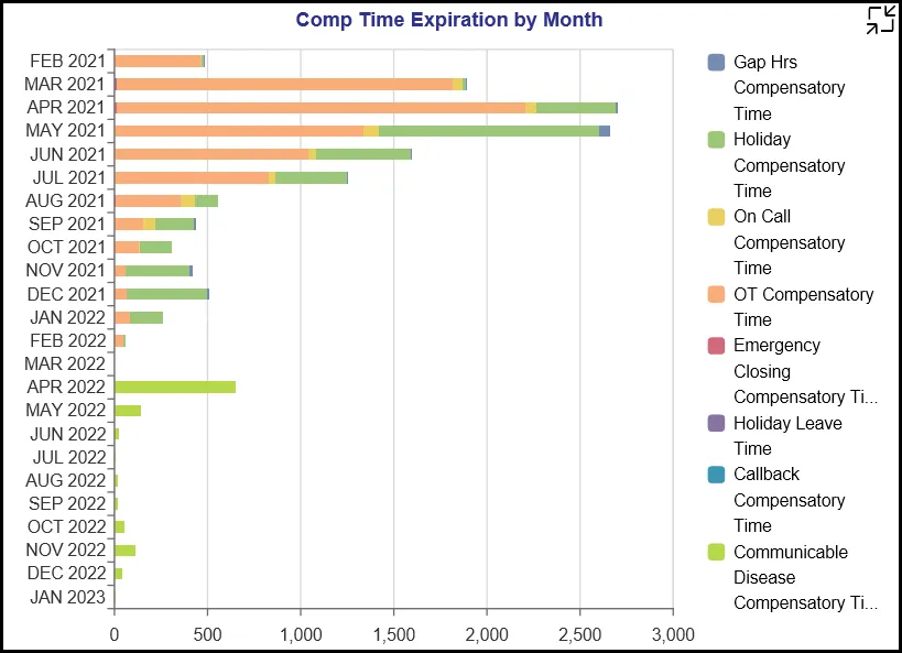
Many charts contain an icon in the upper right corner to enable expansion of the chart to full-screen view.
Note:
- Detailed view icon on ‘Remaining Comp Time Hours and Estimated Cost’ spreadsheet will show a full screen view of the same spreadsheet. This will be an enlarged view of the same and will be useful if the main view has too many rows and cannot fully display all the data.
- Detailed view icon on ‘Comp Time Hours’ chart will display a full screen view of a pie chart and a Heat Map showing Comp Time Estimated Cost by Quota Types.
- Detailed view icon on ‘Comp Time Expiration by Month’ chart would show a full screen view of the same information in a detailed Heat Map chart.
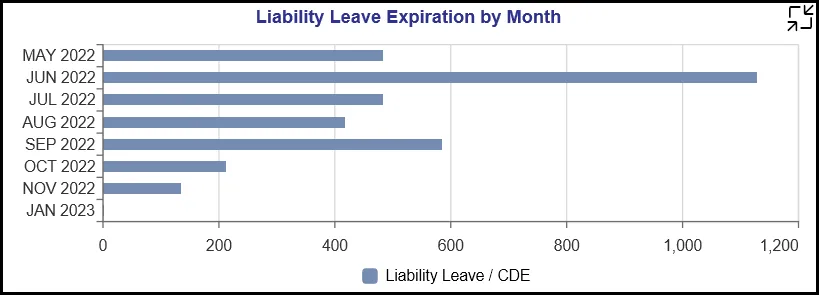
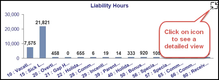
Liability Tab
Below is a sample of the dashboard charts under the Liability tab.
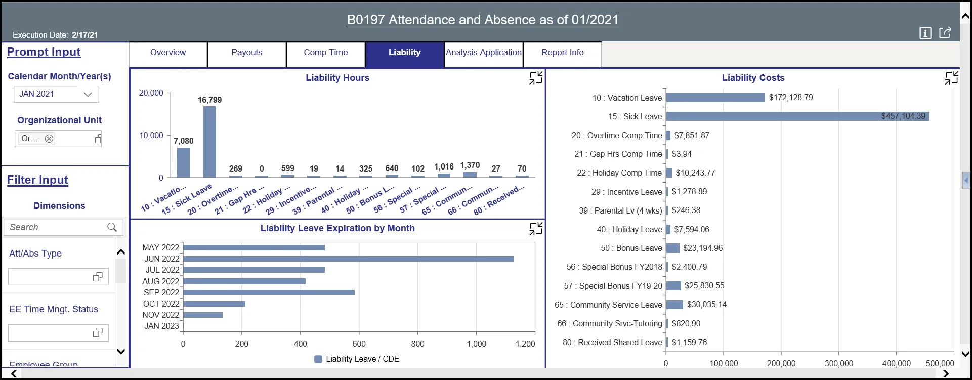
There are three data components displayed in this tab.
- Column Chart component showing Liability Hours by Quota.
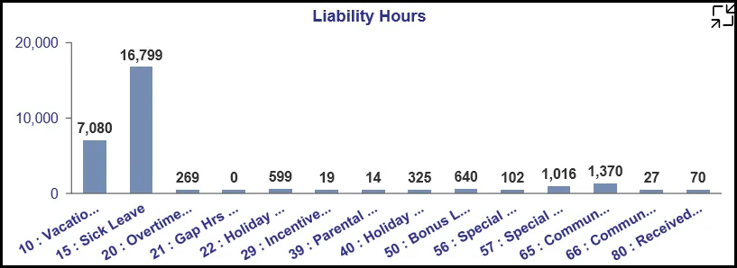
Note: This chart data is based on Time Eval run in the BI backend system and will show only current month and last previous 3-month metrics. Calendar Month/Year chosen outside these range will display “No Data Available.”
- Stacked Bar Chart component showing ‘Liability Leave Expiration by Month’ by Quota Type and Leave Type.
- Bar Chart component showing ‘Liability Costs’ by Quota.
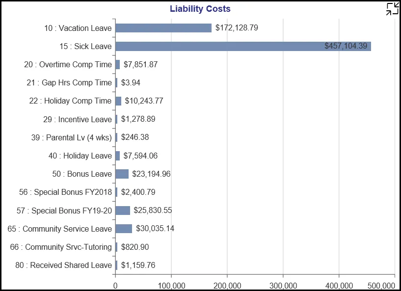
Note: This chart data is based on Time Eval run in the BI backend system and will show only current month and last previous 3-month metrics. Calendar Month/Year chosen outside these range will display ‘No Data Available.’
Many charts contain an icon in the upper right corner to enable expansion of the chart to full-screen view.
Note:
- Detailed view icon on ‘Liability Hours’ chart will show a full screen view of the same information in a Heat Map chart. This will be an enlarged view of the same in a Heat Map chart and will be useful if the main view has too many column bars to fully display all data.
- Detailed view icon on ‘Liability Leave Expiration by Month’ chart will show a full screen view of the same information in a Heat Map chart. This will be an enlarged view of the same in a Heat Map chart and will be useful if the main view has too many horizontal bars to fully display all data.
- Detailed view icon on ‘Liability Costs’ chart will show a full screen view of the same information in a Heat Map chart. This will be an enlarged view of the same in a Heat Map chart and will be useful if the main view has too many horizontal bars to fully display all data.
Analysis Application Tab
The Analysis Application tab is an interactive interface to manipulate the data table on the workspace to customize this data view.
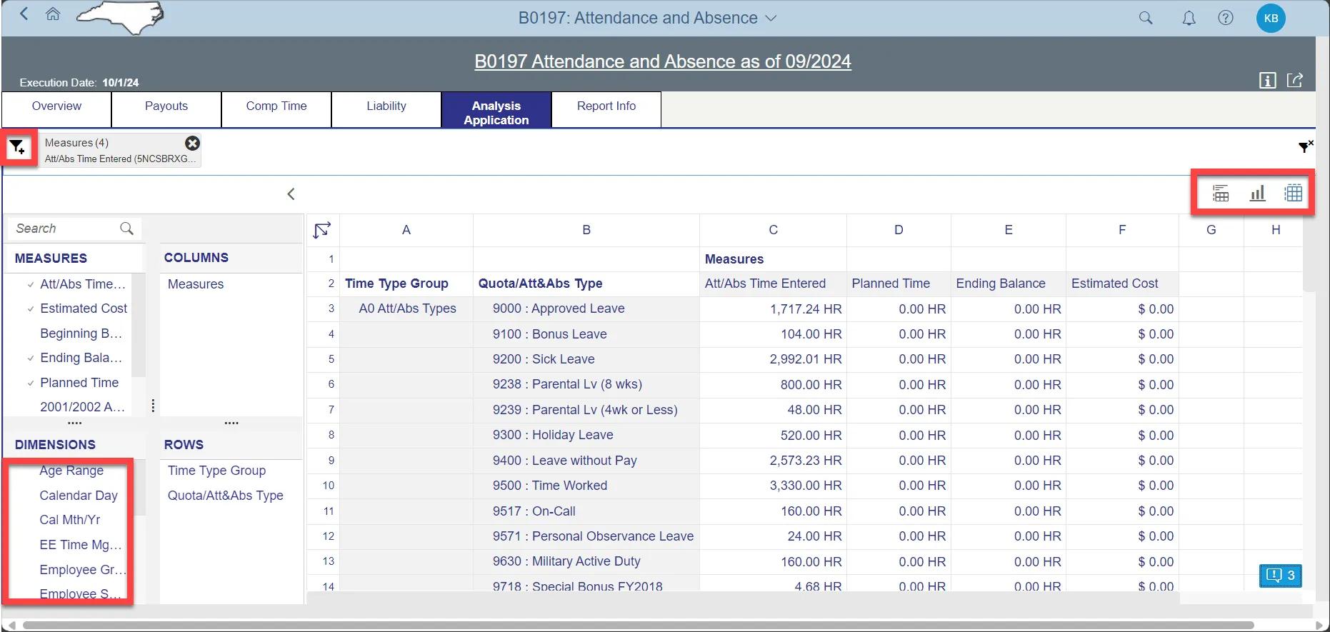
- Dimensions can be dragged into the ‘ROWS’ area to customize the data table.
- The funnel icon can be used to apply additional dimension filters to the data set.
- Note: Applying filters in this tab will NOT affect the data on all other tabs (Overview, Payouts, Comp Time, Liability).
- Upper right corner has controls to enable switching your data view to a different type of chart or table.
- Note: Data shown in this tab are from both backend BI info-providers ZPT_C01 (time eval data, Time Labor Quotas) and ZPT_C02 (Attendance and Absence). There is a possibility of data showing doubled up if the same Quota/Att&Abs Type is pulled from two data providers to show the results here. Users are advised to use the filter dimension ‘InfoProvider’ to choose appropriate data providers from the list of ZPT_C01 or ZPT_C02. HINT: Use the funnel icon and choose ‘InfoProvider.’
Additional Standard Controls
The upper right corner contains two standard controls available.

- The Info icon displays the information about the dashboard.
- The Export icon allows exporting to various formats.
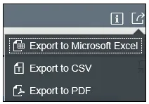
- Export to PDF will export images from the current active tab.
Note: PDF export of heat map in Location tab is not available. The heat map image can be captured via screenshot if desired.
Special Report Considerations/Features
- Temporary employees are included.
- Note: To exclude Temp Employees, Filter Input panel filters on Employee Group dimension values ‘O’ and ‘X’ can be used, and filter on Employee Subgroup dimension to exclude specific employee subgroups.
- Comp Time aging charts in Comp Time will always reflect the age out expiry information as of current date. Changing the ‘Calendar Month/Year’ prompt value in Prompt Input panel will not have any impact on this tab. Comp Time age out is always As of Current SysDate (report run date).
- Source data for Planned Hours shown in Overview tab of this dashboard is refreshed on Wednesdays and Saturdays.
- Negative Time reporting category populations’ time not entered in the backend system will have an impact in the Absentee Rate being shown in this dashboard.
- Sometime the X-axis Y-axis texts are shortened and may not show the full text due to space. Hover the Mouse over the text will show the full text.
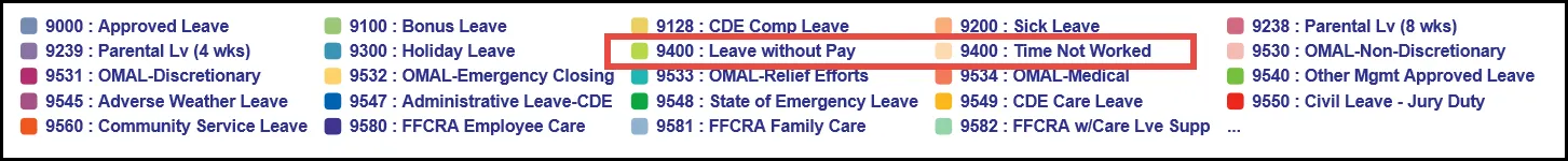
- Att/Abs Type key value ‘9400’ has text description ‘9400: Leave without Pay’ for Regular FT and PT employees and key value ‘A0009400’ has text description ‘9400: Time Not Worked’ for Temporary employees in ERP HR Payroll System. This may appear in ‘Absenteeism by Calendar Month’ full screen detail view chart with ‘9400’ text description if there are Absence hours entered for both types of employees: Regular and Temporary employees.
How to see ‘Key and Text’ in Prompt Input and Filter Input panels
There are 3 steps to complete this process.
Step 1: Choose Organization Prompt from Prompt Input panel.
Step 2: Choose on the icon at the far right.
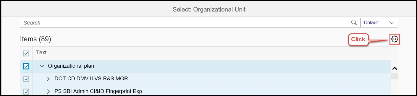
Step 3: Choose Key and Text.
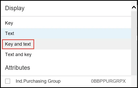
Note: Key and Text can be selected the same way in Filter Input panel dimensions too.
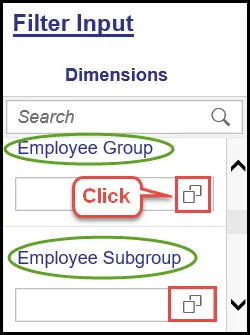
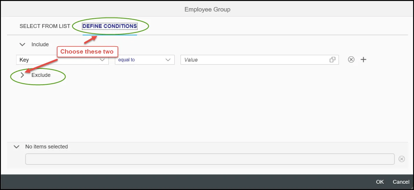
How to exclude Temporary Employees
There are 7 steps to complete this process.
Step 1: Choose Employee Group or Employee Subgroup filter dimension from Filter Input panel.
Step 2: Choose ‘Define Conditions’ Tab and then expand the ‘Exclude.’
Step 3: Click on the icon in Value box.

Step 4: Choose ‘Supplemental Staff (O)’ and press OK.
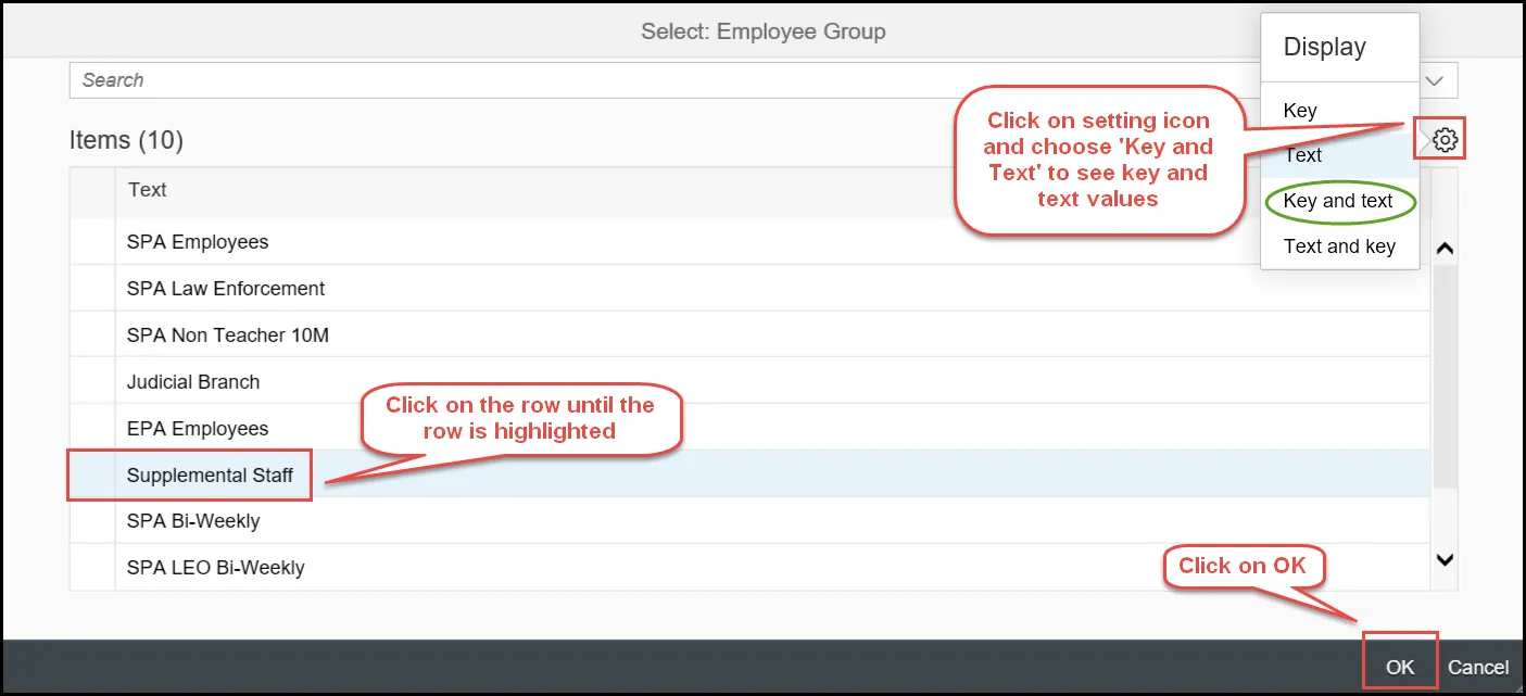
Step 5: To add more Exclude values like ‘Supplemental Staff Grant (X) ‘, choose the ‘+’ symbol at the end and add a row. Select another value from the selection list as the same way in step 4.

Step 6: Click on OK after the two required exclude values are selected.
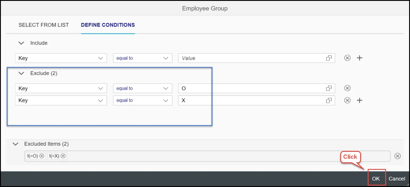
Step 7: The report will display after excluding the selected values.
Note: Employee Subgroups specific to Temp Employees can also be excluded in the same way.
Employee Groups
- O – Supplemental Staff
- X – Supplemental Staff Grant
- J – Judicial Branch
Employee Subgroups
| 0E PT S-FLSAOT Temp MAG 15 FT N-FLSAOT Temp Dir 1E PT N-FLSAOT Temp Dir 25 FT N-FLSAOT Temp JB1 2E PT N-FLSAOT Temp JB1 35 FT N-FLSAOT Temp JB2 3E PT N-FLSAOT Temp JB2 45 FT N-FLSAOT Temp JB3 4E PT N-FLSAOT Temp JB3 55 FT N-FLSAOT Temp DA 5E PT N-FLSAOT Temp DA 65 FT N-FLSAOT Temp ADA 6E PT N-FLSAOT Temp ADA 75 FT N-FLSAOT Temp MAG 7E PT N-FLSAOT Temp MAG 85 FT S-FLSAOT Temp CR 8E PT S-FLSAOT Temp CR 95 FT N-FLSAOT Temp CSC 9E PT N-FLSAOT Temp CSC Q5 FT N-FLSAOT Temp SC QE PT N-FLSAOT Temp SC S5 FT N-FLSAOT Temp CJP SE PT N-FLSAOT Temp CJP SI FT N-FLSAOT Temp ACJP SL PT N-FLSAOT Temp ACJP SO FT S-FLSAOT Temp ACJP SR PT S-FLSAOT Temp ACJP T5 FT N-FLSAOT Temp AD TE PT N-FLSAOT Temp AD U5 FT N-FLSAOT Temp JBS UE PT N-FLSAOT Temp JBS V5 FT S-FLSAOT Temp JBS VE PT S-FLSAOT Temp JBS A6 FT N-FLSAOT Student A7 FT N-FLSAOT Intermit B6 FT S-FLSAOT Student B7 FT S-FLSAOT Intermit G7 Temp FT N-FLSAOT G8 Temp FT S-FLSAOT GA Temp PT N-FLSAOT GB Temp PT S-FLSAOT GC Temp Sol FT N-FLSAOT GC Temp Sol FT N-FLSAOT GD Temp Sol FT S-FLSAOT GE Temp Sol PT N-FLSAOT GF Temp Sol PT S-FLSAOT WF PT N-FLSAOT Student WG PT N-FLSAOT Intermit Y6 PT S-FLSAOT Student Y7 PT S-FLSAOT Intermit G1 Contractor G3 Volunteer G4 Board Member G5 National Guard G6 Federal |
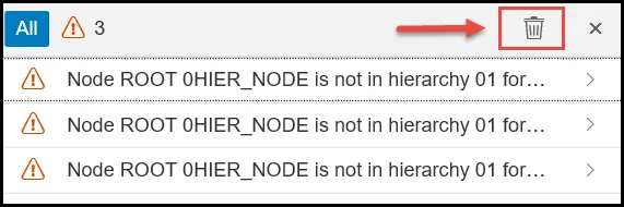
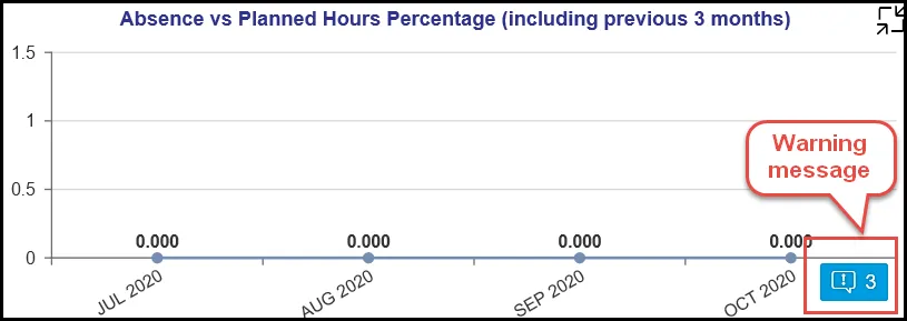
What happens when Calendar Month/Year is chosen beyond 4-month period?
Result in as a Warning Message on the chart.
The ‘Absence vs Planned Hours Percentage (including Previous 3 Months’ chart in Overview tabs is designed to show only current month plus previous 3 months of metrics as the Time Eval data being used in this chart is loaded only for this time-period in the backend BI system.
If the Calendar Month/Year prompt is chosen outside this calendar month range, the report will show warning error indicators in the dashboard. There are 4 steps to complete this process.
Step 1: Click on the warning message to see details.
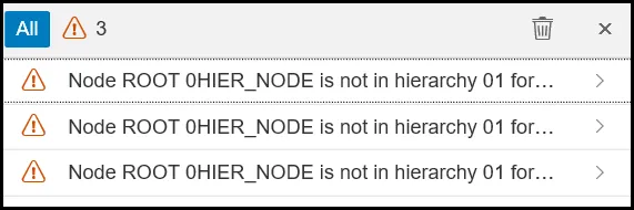
Step 2: Further details of the error message can be seen by clicking on the > arrow icon.
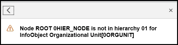
Step 3: Select the “<” arrow to go back.
Step 4: Users can clear these error indicators/messages and proceed.